在开发项目中,修改输入占位符样式,多行文本溢出,隐藏滚动条,修改光标颜色,水平和垂直居中等等,这些都是我们非常熟悉的开发场景!前端开发者几乎每天都会和它们打交道,因此,我在这里给大家总结了20个超级实用的CSS技巧,一起来看看吧。
1.解决图片5px间距问题
你是否经常遇到图片底部多出5px间距的问题?不着急,这里有4种方法可以帮助你解决此问题。
解决方案 1:将 font-size: 0 设置为父元素
演示地址:https://codepen.io/qianlong/pen/VwrzoyE
具体实现代码如下:
HTML
<!DOCTYPE html>
<html lang="en">
<head>
  <meta charset="UTF-8">
  <meta http-equiv="X-UA-Compatible" content="IE=edge">
  <meta name="viewport" content="width=device-width, initial-scale=1.0">
  <title>image 5px spacing</title>
</head>
<body>
  <div class="img-container">
    <img src="https://cdn-images-1.medium.com/max/1600/0*MU3iBxNwssZWt6Tj" alt="">
  </div>
</body>
</html>
CSS
<!DOCTYPE html>
<html lang="en">
<head>
  <meta charset="UTF-8">
  <meta http-equiv="X-UA-Compatible" content="IE=edge">
  <meta name="viewport" content="width=device-width, initial-scale=1.0">
  <title>image 5px spacing</title>
</head>
<body>
  <div class="img-container">
    <img src="https://cdn-images-1.medium.com/max/1600/0*MU3iBxNwssZWt6Tj" alt="">
  </div>
</body>
</html>
解决方案 2:将 display: block 设置为 img演示地址:https://codepen.io/qianlong/pen/eYeGONM具体实现代码如下:
HTML
<!DOCTYPE html>
<html lang="en">
<head>
  <meta charset="UTF-8">
  <meta http-equiv="X-UA-Compatible" content="IE=edge">
  <meta name="viewport" content="width=device-width, initial-scale=1.0">
  <title>image 5px spacing</title>
</head>
<body>
  <div class="img-container">
    <img src="https://cdn-images-1.medium.com/max/1600/0*MU3iBxNwssZWt6Tj" alt="">
  </div>
</body>
</html>
CSS
   html,body{
      margin: 0;
      padding: 0;
    }

    .img-container{
      background-color: lightblue;
    }

    img{
      width: 100%;
      /* Key Style */
      display: block;
    }
解决方案 3:将 vertical-align: bottom 设置为 img
演示地址:https://codepen.io/qianlong/pen/jOaGNWw
具体实现代码如下:
HTML
<!DOCTYPE html>
<html lang="en">
<head>
  <meta charset="UTF-8">
  <meta http-equiv="X-UA-Compatible" content="IE=edge">
  <meta name="viewport" content="width=device-width, initial-scale=1.0">
  <title>image 5px spacing</title>
</head>
<body>
  <div class="img-container">
    <img src="https://cdn-images-1.medium.com/max/1600/0*MU3iBxNwssZWt6Tj" alt="">
  </div>
</body>
</html>
CSS
    html,body{
      margin: 0;
      padding: 0;
    }

    .img-container{
      background-color: lightblue;
    }

    img{
      width: 100%;
      /* Key Style */
      vertical-align: bottom;
    }
方案四:给父元素设置line-height: 5px
演示地址:https://codepen.io/qianlong/pen/PoOJYzN
具体实现代码如下:
HTML
<!DOCTYPE html>
<html lang="en">
<head>
  <meta charset="UTF-8">
  <meta http-equiv="X-UA-Compatible" content="IE=edge">
  <meta name="viewport" content="width=device-width, initial-scale=1.0">
  <title>image 5px spacing</title>
</head>
<body>
  <div class="img-container">
    <img src="https://cdn-images-1.medium.com/max/1600/0*MU3iBxNwssZWt6Tj" alt="">
  </div>
</body>
</html>
CSS
   html,body{
      margin: 0;
      padding: 0;
    }

    .img-container{
      background-color: lightblue;
      /* Key Style */
      line-height: 5px;
    }

    img{
      width: 100%;
    }
2.元素高度与窗口相同
演示地址:https://codepen.io/qianlong/pen/xxPXKXe
如何让元素和窗口一样高?示例代码如下:
   html,body{
      margin: 0;
      padding: 0;
    }

    .img-container{
      background-color: lightblue;
      /* Key Style */
      line-height: 5px;
    }

    img{
      width: 100%;
    }
* {
margin: 0;
padding: 0;
}
.child {
width: 100%;
/* Key Style */
height: 100vh;
background-image: linear-gradient(180deg, #2af598 0%, #009efd 100%);
}
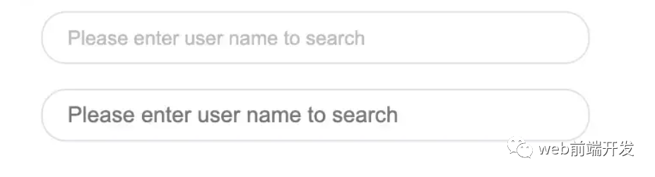
3.修改输入占位符样式
演示地址:https://codepen.io/qianlong/pen/JjOrPOq
第一个修改了,第二个没有修改。
<input type="text" class="placehoder-custom" placeholder="Please enter user name to search">
<input type="text" placeholder="Please enter user name to search">
* {
  margin: 0;
  padding: 0;
}

input {
  width: 300px;
  height: 30px;
  border: none;
  outline: none;
  display: block;
  margin: 15px;
  border: solid 1px #dee0e9;
  padding: 0 15px;
  border-radius: 15px;
}
/* Key Style */
.placehoder-custom::-webkit-input-placeholder {
  color: #babbc1;
  font-size: 12px;
}
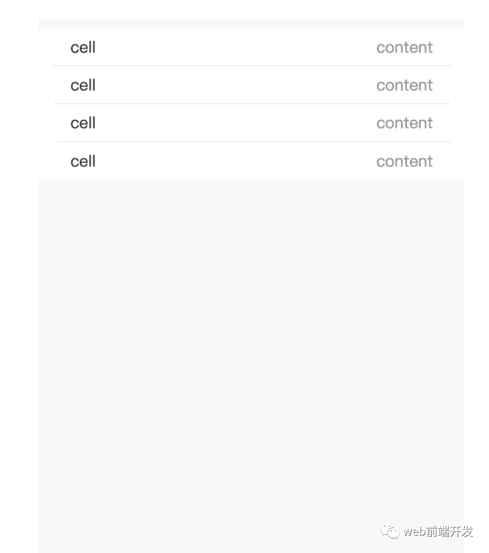
4. 使用“:not”选择器
演示地址:https://codepen.io/qianlong/pen/QWOqLQO
除了最后一个元素之外的所有元素都需要一些样式,使用 not 选择器会非常容易。
如下图:最后一个元素没有底边框。
<ul>
  <li>
    <span>cell</span>
    <span>content</span>
  </li>
  <li>
    <span>cell</span>
    <span>content</span>
  </li>
  <li>
    <span>cell</span>
    <span>content</span>
  </li>
  <li>
    <span>cell</span>
    <span>content</span>
  </li>
</ul>
<ul>
<li>
<span>cell</span>
<span>content</span>
</li>
<li>
<span>cell</span>
<span>content</span>
</li>
<li>
<span>cell</span>
<span>content</span>
</li>
<li>
<span>cell</span>
<span>content</span>
</li>
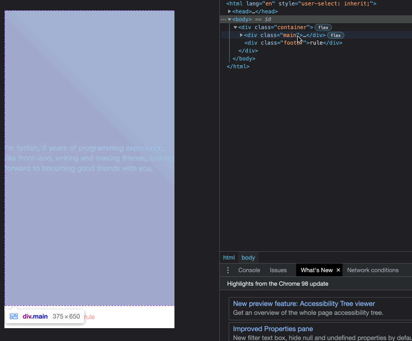
</ul>5.使用flex布局智能固定一个元素在底部
演示地址:https://codepen.io/qianlong/pen/ZEaXzxM
当内容不够时,按钮应该在页面底部。当有足够的内容时,按钮应该跟随内容。当你遇到类似问题时,使用flex实现智能布局!
代码如下:
<div class="container">
  <div class="main">I'm fatfish, 6 years of programming experience, like front-end, writing
    and making friends,looking forward to becoming good friends with you.</div>
  <div class="footer">rule</div>
</div>
* {
  margin: 0;
  padding: 0;
}

.container {
  height: 100vh;
  /* Key Style */
  display: flex;
  flex-direction: column;
  justify-content: space-between;
}

.main {
  /* Key Style */
  flex: 1;
  background-image: linear-gradient(
    45deg,
    #ff9a9e 0%,
    #fad0c4 99%,
    #fad0c4 100%
  );
  display: flex;
  align-items: center;
  justify-content: center;
  color: #fff;
}

.footer {
  padding: 15px 0;
  text-align: center;
  color: #ff9a9e;
  font-size: 14px;
}
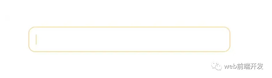
6.使用“caret-color”修改光标颜色
演示地址:https://codepen.io/qianlong/pen/YzErKvy
有时需要修改光标的颜色。现在是插入符号颜色显示时间。
<input type="text" class="caret-color" />
* {
margin: 0;
padding: 0;
}
body {
display: flex;
justify-content: center;
}
.caret-color {
width: 300px;
padding: 10px;
margin-top: 20px;
border-radius: 10px;
border: solid 1px #ffd476;
box-sizing: border-box;
background-color: transparent;
outline: none;
color: #ffd476;
font-size: 14px;
/* Key Style */
caret-color: #ffd476;
}
.caret-color::-webkit-input-placeholder {
color: #4f4c5f;
font-size: 14px;
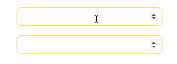
}7.去掉type=”number”末尾的箭头
演示地址:https://codepen.io/qianlong/pen/OJOxLrg
默认情况下,input type = “number”的末尾会出现一个小箭头,但有时我们需要将其去掉。我们应该做什么?
如下图:第二个去掉了,第一个没有。
<input type="number" />
<input type="number" class="no-arrow" />
* {
  margin: 0;
  padding: 0;
}

body {
  display: flex;
  justify-content: center;
  align-items: center;
  flex-direction: column;
}

input {
  width: 300px;
  padding: 10px;
  margin-top: 20px;
  border-radius: 10px;
  border: solid 1px #ffd476;
  box-sizing: border-box;
  background-color: transparent;
  outline: none;
  color: #ffd476;
  font-size: 14px;
  caret-color: #ffd476;
  display: block;
}

input::-webkit-input-placeholder {
  color: #4f4c5f;
  font-size: 14px;
}
/* Key Style */
.no-arrow::-webkit-outer-spin-button,
.no-arrow::-webkit-inner-spin-button {
  -webkit-appearance: none;
}
8.“outline:none”去掉输入状态行
演示地址:https://codepen.io/qianlong/pen/YzErzKG
当输入框被选中时,默认会有一个蓝色的状态行,可以使用 outline: none 去掉。
如下图:第二个输入框去掉了,第一个没有。
<input type="number" />
<input type="number" class="no-outline" />
* {
  margin: 0;
  padding: 0;
}

body {
  display: flex;
  justify-content: center;
  align-items: center;
  flex-direction: column;
}

input {
  width: 300px;
  padding: 10px;
  margin-top: 20px;
  border-radius: 10px;
  border: solid 1px #ffd476;
  box-sizing: border-box;
  background-color: transparent;
  color: #ffd476;
  font-size: 14px;
  caret-color: #ffd476;
  display: block;
}
/* Key Style */

.no-outline {
  outline: none;
}
9.解决iOS滚动条卡住的问题
在苹果手机上,经常会出现滚动时元素卡住的情况。这个时候只有一行CSS会支持弹性滚动。
body,html{
-webkit-overflow-scrolling: touch;
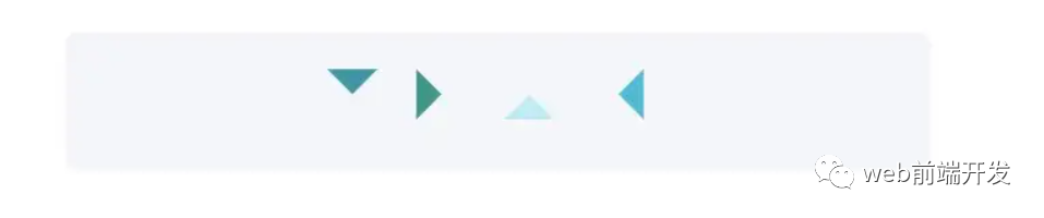
}10.画三角形
演示地址:https://codepen.io/qianlong/pen/rNYGNRe
<div class="box">
  <div class="box-inner">
    <div class="triangle bottom"></div>
    <div class="triangle right"></div>
    <div class="triangle top"></div>
    <div class="triangle left"></div>
  </div>
</div>
* {
  margin: 0;
  padding: 0;
}

body {
  padding: 15px;
}

.box {
  padding: 15px;
  background-color: #f5f6f9;
  border-radius: 6px;
  display: flex;
  align-items: center;
  justify-content: center;
}

.triangle {
  display: inline-block;
  margin-right: 10px;
  /* Base Style */
  border: solid 10px transparent;
}
/*bottom*/
.triangle.bottom {
  border-top-color: #0097a7;
}
/*top*/
.triangle.top {
  border-bottom-color: #b2ebf2;
}
/*left*/
.triangle.left {
  border-right-color: #00bcd4;
}
/*right*/
.triangle.right {
  border-left-color: #009688;
}
11.画小箭头
演示地址:https://codepen.io/qianlong/pen/ZEaXEEP
<div class="box">
  <div class="box-inner">
    <div class="arrow bottom"></div>
    <div class="arrow top"></div>
    <div class="arrow right"></div>
    <div class="arrow left"></div>
  </div>
</div>
* {
margin: 0;
padding: 0;
}
body {
padding: 15px;
}
.box {
padding: 15px;
background-color: #ffffff;
border-radius: 6px;
display: flex;
align-items: center;
justify-content: center;
}
.arrow {
display: inline-block;
margin-right: 10px;
width: 0;
height: 0;
/* Base Style */
border: 16px solid;
border-color: transparent #cddc39 transparent transparent;
position: relative;
}
.arrow::after {
content: "";
position: absolute;
right: -20px;
top: -16px;
border: 16px solid;
border-color: transparent #fff transparent transparent;
}
/*bottom*/
.arrow.bottom {
transform: rotate(270deg);
}
/*top*/
.arrow.top {
transform: rotate(90deg);
}
/*left*/
.arrow.left {
transform: rotate(180deg);
}
/*right*/
.arrow.right {
transform: rotate(0deg);
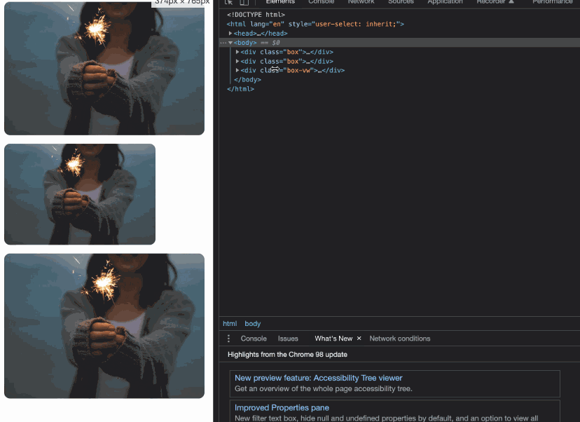
}12.图像适合窗口大小
演示地址:https://codepen.io/qianlong/pen/PoOJoPO
vw vs padding
<div class="box">
  <div class="img-container">
    <img src="https://cdn-images-1.medium.com/max/1600/0*tuDPftoIhupd-qx-.jpg" alt="">
  </div>
</div>

<div class="box">
  <div class="img-container">
    <img src="https://cdn-images-1.medium.com/max/1600/0*tuDPftoIhupd-qx-.jpg" alt="">
  </div>
</div>

<div class="box-vw">
  <div class="img-container">
    <img src="https://cdn-images-1.medium.com/max/1600/0*tuDPftoIhupd-qx-.jpg" alt="">
  </div>
</div>
* {
  margin: 0;
  padding: 0;
}

body {
  padding: 15px;
}

.box,
.box-vw {
  background-color: #010102;
  border-radius: 10px;
  overflow: hidden;
  margin-bottom: 15px;
}

.box:nth-of-type(2) {
  width: 260px;
}
/* vw */
.box-vw .img-container {
  width: 100vw;
  height: 66.620879vw;
  padding-bottom: inherit;
}
/* padding */
.img-container {
  width: 100%;
  height: 0;
  /* Aspect ratio of picture*/
  padding-bottom: 66.620879%;
}

img {
  width: 100%;
}
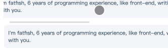
13.隐藏滚动条
演示地址:https://codepen.io/qianlong/pen/yLPzLeZ
第一个滚动条可见,第二个隐藏。
这意味着容器可以滚动,但是滚动条是隐藏的,就好像它是透明的一样。
<div class="box">
  <div>
    I'm fatfish, 6 years of programming experience, like front-end, writing
    and making friends, looking forward to becoming good friends with you.
  </div>
</div>
<div class="box box-hide-scrollbar">
  <div>
    I'm fatfish, 6 years of programming experience, like front-end, writing
    and making friends, looking forward to becoming good friends with you.
  </div>
</div>
* {
margin: 0;
padding: 0;
}
body {
padding: 15px;
color: #324b64;
}
.box {
width: 375px;
overflow: scroll;
}
/* Key Style */
.box-hide-scrollbar::-webkit-scrollbar {
display: none; /* Chrome Safari */
}
.box > div {
margin-bottom: 15px;
padding: 10px;
background-color: #f5f6f9;
border-radius: 6px;
font-size: 12px;
width: 750px;
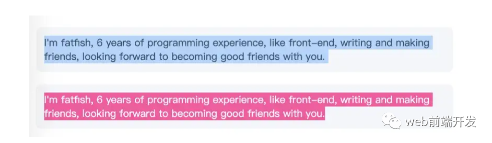
}14.自定义选中的文字样式
演示地址:https://codepen.io/qianlong/pen/jOaGOVQ
<div class="box">
  <p class="box-default">
    I'm fatfish, 6 years of programming experience, like front-end, writing
    and making friends, looking forward to becoming good friends with you.
  </p>
  <p class="box-custom">
    I'm fatfish, 6 years of programming experience, like front-end, writing
    and making friends, looking forward to becoming good friends with you.
  </p>
</div>
* {
margin: 0;
padding: 0;
}
body {
padding: 15px;
color: #324b64;
}
.box > p {
padding: 10px;
background-color: #f5f6f9;
border-radius: 6px;
font-size: 12px;
margin-bottom: 15px;
}
/* Key Style */
.box-custom::selection {
color: #ffffff;
background-color: #ff4c9f;
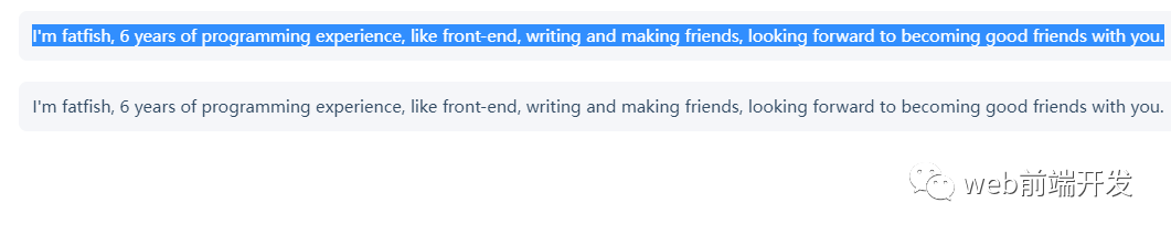
}15.不允许选择文本
演示地址:https://codepen.io/qianlong/pen/rNYGNyB
第一个内容可以选,第二个不可以选中了。
<div class="box">
  <p> I'm fatfish, 6 years of programming experience, like front-end, writing
    and making friends, looking forward to becoming good friends with you.</p>
  <p> I'm fatfish, 6 years of programming experience, like front-end, writing
    and making friends, looking forward to becoming good friends with you.</p>
</div>
* {
  margin: 0;
  padding: 0;
}

body {
  padding: 15px;
  color: #324b64;
}

.box p {
  margin-bottom: 15px;
  padding: 10px;
  background-color: #f5f6f9;
  border-radius: 6px;
  font-size: 12px;
}
/* Key Style */
.box p:last-child {
  user-select: none;
}
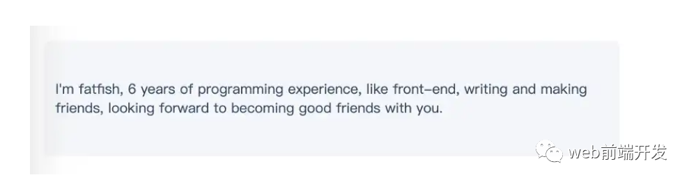
16. 水平和垂直居中元素
演示地址:https://codepen.io/qianlong/pen/VwrMwWb
<div class="parent">
  <p class="child">I'm fatfish, 6 years of programming experience, like front-end, writing
    and making friends, looking forward to becoming good friends with you.</p>
</div>
<div class="parent">
<p class="child">I'm fatfish, 6 years of programming experience, like front-end, writing
and making friends, looking forward to becoming good friends with you.</p>
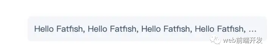
</div>17.单行文字溢出时显示省略号
演示地址:https://codepen.io/qianlong/pen/vYWeYJJ
<div class="box">
  <p class="one-line-ellipsis">Hello Fatfish, Hello Fatfish, Hello Fatfish, Hello Fatfish, Hello Fatfish, Hello Fatfish,Hello Fatfish, Hello Fatfish, Hello Fatfish, Hello Fatfish, Hello Fatfish, Hello Fatfish</p>
</div>
* {
  margin: 0;
  padding: 0;
}

body {
  padding: 15px;
  color: #324b64;
}

.box {
  padding: 10px;
  background-color: #f5f6f9;
  border-radius: 6px;
  font-size: 12px;
}

.one-line-ellipsis {
  /* Key Style */
  overflow: hidden;
  white-space: nowrap;
  text-overflow: ellipsis;
  max-width: 375px;
}
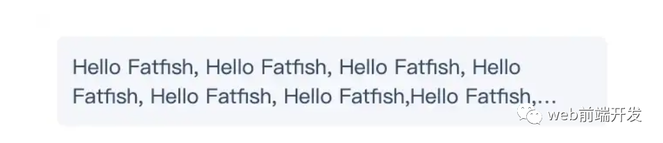
18.多行文字溢出时显示省略号
演示地址:https://codepen.io/qianlong/pen/ZEaXEJg
<div class="box">
  <p class="more-line-ellipsis">Hello Fatfish, Hello Fatfish, Hello Fatfish, Hello Fatfish, Hello Fatfish, Hello Fatfish,Hello Fatfish, Hello Fatfish, Hello Fatfish, Hello Fatfish, Hello Fatfish, Hello Fatfish</p>
</div>
* {
  margin: 0;
  padding: 0;
}

body {
  padding: 15px;
  color: #324b64;
}

.box {
  max-width: 375px;
  padding: 10px;
  background-color: #f5f6f9;
  border-radius: 6px;
  font-size: 13px;
}

.more-line-ellipsis {
  overflow: hidden;
  text-overflow: ellipsis;

  display: -webkit-box;
  /* set n lines, including 1 */
  -webkit-line-clamp: 2;
  -webkit-box-orient: vertical;
}
19.清除浮动
演示地址:https://codepen.io/qianlong/pen/dyZVyZW
这是一种老式的布局方式,现在大部分移动端都不用了。
如下图,外层的高度没有塌陷,这就是为什么要使用clearfix类。
<div class="box">
  <p class="more-line-ellipsis">Hello Fatfish, Hello Fatfish, Hello Fatfish, Hello Fatfish, Hello Fatfish, Hello Fatfish,Hello Fatfish, Hello Fatfish, Hello Fatfish, Hello Fatfish, Hello Fatfish, Hello Fatfish</p>
</div>
* {
  margin: 0;
  padding: 0;
}

body {
  padding: 15px;
  color: #324b64;
}

.box {
  max-width: 375px;
  padding: 10px;
  background-color: #f5f6f9;
  border-radius: 6px;
  font-size: 13px;
}

.more-line-ellipsis {
  overflow: hidden;
  text-overflow: ellipsis;

  display: -webkit-box;
  /* set n lines, including 1 */
  -webkit-line-clamp: 2;
  -webkit-box-orient: vertical;
}
20.使用“filter:grayscale(1)”使页面处于灰色模式
body{
  filter: grayscale(1);
}
一行代码将使页面处于灰色模式,这功能也很实用的,国内最近一周的各大平台,基本都是这个灰色模式,至于原因嘛,大家都知道了,这里就不说了。
这些都是灰色模式,后期如果我们想要恢复到原来的正常模式,我们只需要在CSS里将filter: grayscale(1);这行代码注释掉即可。
写在最后
到这里,我今天所要与你分享的20个关于CSS的实用技巧就结束了,希望这些技巧能帮助到你,如果你觉得有用的话,请记得点赞我,关注我,并将这篇文章分享给你的朋友,也许能够帮助到他。
最后,感谢你的阅读,同时,也期待您的关注,从而阅读更多优质内容。
本文由哈喽比特于2年以前收录,如有侵权请联系我们。
文章来源:https://mp.weixin.qq.com/s/h4-66qQlF_O70TOmBmA-RA
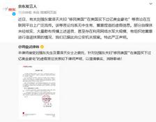
京东创始人刘强东和其妻子章泽天最近成为了互联网舆论关注的焦点。有关他们“移民美国”和在美国购买豪宅的传言在互联网上广泛传播。然而,京东官方通过微博发言人发布的消息澄清了这些传言,称这些言论纯属虚假信息和蓄意捏造。
日前,据博主“@超能数码君老周”爆料,国内三大运营商中国移动、中国电信和中国联通预计将集体采购百万台规模的华为Mate60系列手机。
据报道,荷兰半导体设备公司ASML正看到美国对华遏制政策的负面影响。阿斯麦(ASML)CEO彼得·温宁克在一档电视节目中分享了他对中国大陆问题以及该公司面临的出口管制和保护主义的看法。彼得曾在多个场合表达了他对出口管制以及中荷经济关系的担忧。
今年早些时候,抖音悄然上线了一款名为“青桃”的 App,Slogan 为“看见你的热爱”,根据应用介绍可知,“青桃”是一个属于年轻人的兴趣知识视频平台,由抖音官方出品的中长视频关联版本,整体风格有些类似B站。
日前,威马汽车首席数据官梅松林转发了一份“世界各国地区拥车率排行榜”,同时,他发文表示:中国汽车普及率低于非洲国家尼日利亚,每百户家庭仅17户有车。意大利世界排名第一,每十户中九户有车。
近日,一项新的研究发现,维生素 C 和 E 等抗氧化剂会激活一种机制,刺激癌症肿瘤中新血管的生长,帮助它们生长和扩散。
据媒体援引消息人士报道,苹果公司正在测试使用3D打印技术来生产其智能手表的钢质底盘。消息传出后,3D系统一度大涨超10%,不过截至周三收盘,该股涨幅回落至2%以内。
9月2日,坐拥千万粉丝的网红主播“秀才”账号被封禁,在社交媒体平台上引发热议。平台相关负责人表示,“秀才”账号违反平台相关规定,已封禁。据知情人士透露,秀才近期被举报存在违法行为,这可能是他被封禁的部分原因。据悉,“秀才”年龄39岁,是安徽省亳州市蒙城县人,抖音网红,粉丝数量超1200万。他曾被称为“中老年...
9月3日消息,亚马逊的一些股东,包括持有该公司股票的一家养老基金,日前对亚马逊、其创始人贝索斯和其董事会提起诉讼,指控他们在为 Project Kuiper 卫星星座项目购买发射服务时“违反了信义义务”。
据消息,为推广自家应用,苹果现推出了一个名为“Apps by Apple”的网站,展示了苹果为旗下产品(如 iPhone、iPad、Apple Watch、Mac 和 Apple TV)开发的各种应用程序。
特斯拉本周在美国大幅下调Model S和X售价,引发了该公司一些最坚定支持者的不满。知名特斯拉多头、未来基金(Future Fund)管理合伙人加里·布莱克发帖称,降价是一种“短期麻醉剂”,会让潜在客户等待进一步降价。
据外媒9月2日报道,荷兰半导体设备制造商阿斯麦称,尽管荷兰政府颁布的半导体设备出口管制新规9月正式生效,但该公司已获得在2023年底以前向中国运送受限制芯片制造机器的许可。
近日,根据美国证券交易委员会的文件显示,苹果卫星服务提供商 Globalstar 近期向马斯克旗下的 SpaceX 支付 6400 万美元(约 4.65 亿元人民币)。用于在 2023-2025 年期间,发射卫星,进一步扩展苹果 iPhone 系列的 SOS 卫星服务。
据报道,马斯克旗下社交平台𝕏(推特)日前调整了隐私政策,允许 𝕏 使用用户发布的信息来训练其人工智能(AI)模型。新的隐私政策将于 9 月 29 日生效。新政策规定,𝕏可能会使用所收集到的平台信息和公开可用的信息,来帮助训练 𝕏 的机器学习或人工智能模型。
9月2日,荣耀CEO赵明在采访中谈及华为手机回归时表示,替老同事们高兴,觉得手机行业,由于华为的回归,让竞争充满了更多的可能性和更多的魅力,对行业来说也是件好事。
《自然》30日发表的一篇论文报道了一个名为Swift的人工智能(AI)系统,该系统驾驶无人机的能力可在真实世界中一对一冠军赛里战胜人类对手。
近日,非营利组织纽约真菌学会(NYMS)发出警告,表示亚马逊为代表的电商平台上,充斥着各种AI生成的蘑菇觅食科普书籍,其中存在诸多错误。
社交媒体平台𝕏(原推特)新隐私政策提到:“在您同意的情况下,我们可能出于安全、安保和身份识别目的收集和使用您的生物识别信息。”
2023年德国柏林消费电子展上,各大企业都带来了最新的理念和产品,而高端化、本土化的中国产品正在不断吸引欧洲等国际市场的目光。
罗永浩日前在直播中吐槽苹果即将推出的 iPhone 新品,具体内容为:“以我对我‘子公司’的了解,我认为 iPhone 15 跟 iPhone 14 不会有什么区别的,除了序(列)号变了,这个‘不要脸’的东西,这个‘臭厨子’。


